Canonical
on 25 July 2014
In the previous Blog Post, we looked at how we use the Recency principle to redesign the experience around bookmarks, tabs and history.
In this blog post, we look at how the new Ubuntu Browser makes the UI fade to the background in favour of the content. The design focuses on physical impulse familiarity – “muscle memory” – by marrying simple gestures to the two key browser tasks, making the experience feel as fluid and simple as flipping through a magazine.
Creating a new tab
For all new browsers, the approach to the URI Top Bar that enables searching as well as manual address entry has made the “new tab” function more central to the experience than ever. In addition, evidence suggests that opening a new tab is the third of the most frequently used action in browser. To facilitate this, we made opening a new tab effortless and even (we think) a bit fun.
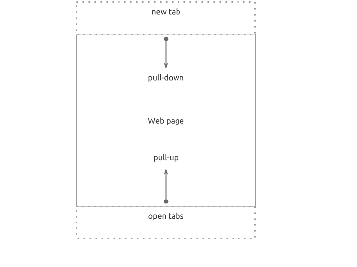
By pulling down anywhere on the current page, you activate a sprint loaded “new tab” feature that appears under the address bar of the page. Keep dragging far enough, and you’ll see a new blank page coming into view. If you release at this stage, a new tab will load ready with the address bar and keyboard open as well as an easy way to get to your bookmarks. But, if you change your mind, just drag the current page back up or release early and your current page comes back.
Get to your open tabs and recently visited sites
Pulling the current page downward can create a new blank tab, and conversely dragging the bottom edge upward shows you already open tabs ordered by recency that echoes the right edge “open apps” view.
If you keep on dragging upward without releasing, you can dig even further into the past with your most recently visited pages grouped by site in a “history” list. By grouping under the site domain name, it’s easier to find what you’re looking for without thumbing through hundreds of individual page URLs. However, if you want all the detail, tap an item in the list to see your complete history.

It’s not easy to improve upon such a well-worn application as the browser, it’s true. We’re hopeful that by adding new fluidity to creating, opening and switching between tabs, our users will find that this browsing experience is simpler to use, especially with one hand, and feels more seamless and fluid than ever.


